Why is vinyl crucial for field photography?
We are in the process of finding and photographing all the fish, shellfish, reptiles, mammals, insects, arachnids and other creatures which are utilized by the Maya people of Mesoamerica (southern Mexico, Guatemala, Belize, and adjoining parts of Honduras and El Salvador).
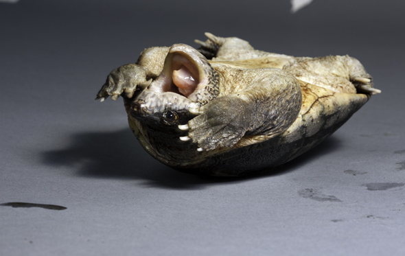
We often rescue reptiles from local people; we then release the reptiles back into their natural habitat. Recently we rescued a snapping turtle that was being beaten to death by local kids (they and their parents were convinced these turtles are venomous).
When we are photographing most creatures, they tend to urinate or defecate on the backdrop material. And of course the turtles are generally a bit wet, as are the fish (the catfish is a prime actor on Maya mythology of the Popol Vuh).
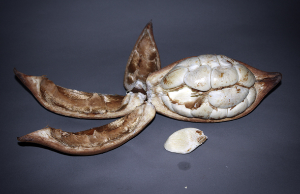
So here we show unretouched photos of why using paper as a backdrop is not a good idea. Yes, of course, you can get rid of most of the stains in Adobe Photoshop. But it is better to use a material that does not stain, and whose surface won’t immediately change color just because the hermit crab is still a bit wet (a major Maya deity, God N, also known as Pahuatun, is modeled after a hermit crab). Fortunately most are up on the dry beach, but if the tide is coming in or out, they may still be wet.
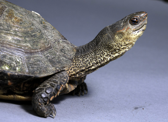
Turtle Rhinoclemmys pulcherrima, Photo by Nicholas Hellmuth, Guatemala.
Turtle Straurotypus salvini, Photo by Nicholas Hellmuth, Guatemala
Turtle Straurotypus salvini, Photo by Nicholas Hellmuth, Guatemala
Pachira aquatica, Zapoton fruit cut, Photo by Sofia Monzon, Guatemala
Pachira aquatica, Zapoton fruit cut, Photo by Sofia Monzon, Guatemala
At Photokina 2010 (or possibly earlier) I noticed that Savage Universal Corporation offered a vinyl backdrop material. So now we are looking forward to evaluate this material.
The vinyl comes in the most important basic colors:
- Pure white
- Matte black
- Photo gray
- Chroma green
We like photo gray because then also you don’t need a gray card in the photo! You can balance the color directly from the background. Plus gray is a pleasant neutral color. When photographing nature, I prefer not to use a color that distracts from the beauty of Mother Nature.
White is essential for some subjects, and also white is easy to remove in Adobe Photoshop (depending on the color of what your subject is).
Black looks good for some subjects; and some graphic design layouts, for magazine articles, books (or comparable digital material), the designer may like a black look.
Chroma green is essential when you have a preference for using chroma green to knock off the background material. Just be sure your lighting does not reflect any of the green color onto your subject.
First posted January 12, 2012.


